10 High-Performing Project Management Charts for 2023

Clear data visualization is one of the keys to project management success. You may have grand plans with dozens of strategies and hundreds of tasks in your head. However, a project management chart is what will really help you structure and systematize all your planned affairs.
There are many types of project management charts that you may consider. They organize resources and technologies to let you execute projects successfully.
In this article, we’ll explore the best project management charts that allow visualizing and understanding important data with ease. So here we go.
Contents:
- What is a project management chart?
- Types of project management charts.
- Gantt chart.
- PERT diagram.
- Pareto chart.
- WBS.
- Bar chart.
- Flowchart.
- SWOT analysis.
- Pie chart.
- Control chart.
- Cause and effect chart.
- Chart preferences and project size.
What is a project management chart?
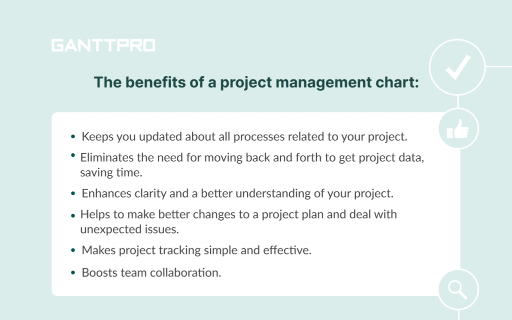
A project management chart is a visual representation of all tasks and processes related to a project. This data may also include the timeline of various project events that have to be performed in the right durations.
This tool makes key information about your project easier to learn, interpret, and apply. It assists managers to plan all processes since it shows correlations between tasks and resources. Thanks to this clear visualization, the charts enable them to gain insight into a project’s progress.
The charts used in project management may contain essential information, such as task dependencies, deadlines, milestones, key resources, and other task details. You can utilize them in task management, project planning, team collaboration, progress tracking, and resource management.
Why use a project management chart
Small projects that include a limited set of data need to be tracked throughout their life cycles. However, as the project complexity rises, managers need to observe more and more data. This is where a smart visual chart can be of true help.
With the help of this chart managers can analyze and extract useful project information without extra effort.
The benefits mentioned above are common among most project management charts. However, it’s worth noting that every single graph has its own set of advantages and characteristics that make it suitable for use in a particular situation.
Types of project management charts
There are many various types of project management charts and diagrams used by managers and teams. Some of them are designed in accordance with processes while few perform at the task level.
Different types of charts in project management make processes smooth and efficient. It positively affects spotting problems at an early stage. Having a concrete view of projects, managers can set realistic deadlines, ensure unhindered delivery, and execute a project successfully.
So what is the best chart for project management? We are here to provide you with the top solutions.
If you’re a project manager and want to start a project plan, take a moment to look over the best project planning and management graphs to make your work clearly understandable.
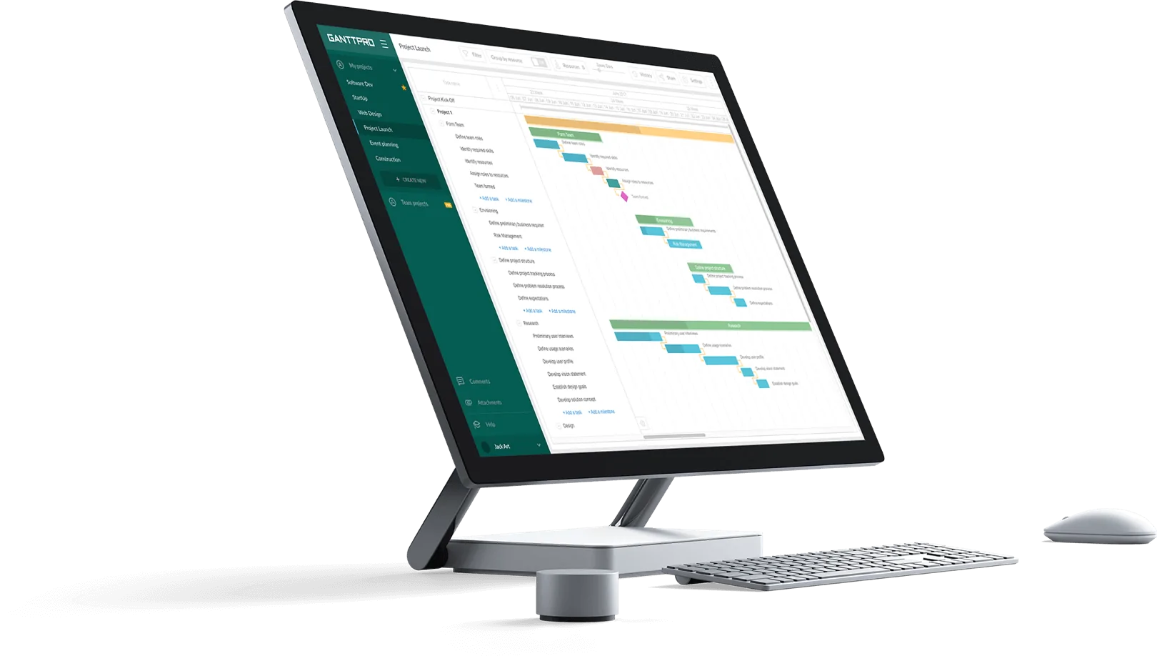
1. Gantt chart
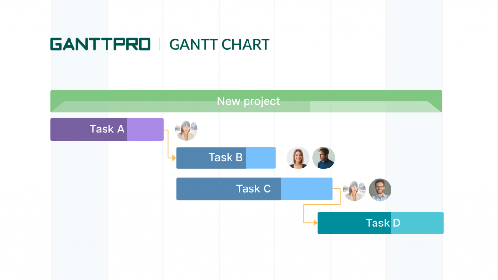
A Gantt chart is undoubtedly the most demanded solution among the project management charts and graphs that modern businesses use to plan and control their projects.
According to the statistics (2018), a Gantt diagram is ranked fourth among the most requested features of project management tools (after file sharing, time tracking, and email integration).
Almost everyone who enters the world of modern project management sooner or later faces the question “What is a Gantt chart and why is it important?”
Well, the truth is that this diagram, invented by the American engineer and management consultant, Henry L. Gantt around the years 1910–1915, provides a neat and clear timeline view of your projects.
With its help, you can showcase how various project tasks or activities are connected with each other and how they fit in the overall project timeline.
Advanced project management with a Gantt chart
Plan and manage projects effectively. All in one place.
Sign up for freeThe vertical axis of a Gantt chart online system represents project tasks; the horizontal axis shows the time duration.
The diagram assists in planning, scheduling and assigning tasks, setting task dependencies, associating milestones with tasks, and tracking progress. It also allows you to identify a critical path of your project and implement a CPM in project management (the critical path method).
Gantt chart benefits:
- Provides a high-level overview of a timeline. This is an obvious advantage and difference, especially in the case of comparing Gantt chart vs. Kanban.
- Assists in time tracking, monitoring activities, targets, and the entire project.
- Allows for resource management.
- Simplifies juggling complex projects simultaneously.
- Helps to set realistic deadlines.
- Facilitates realistic expectations because it reflects the hierarchy of tasks that need to be completed.
- Allows teams to see what’s happening and what isn’t.
- Makes difficult information manageable.
Provided by tools: GanttPRO, MeisterTask, Paymo.
It’s crucial to note that many newcomers and project managers without experience often confuse a Gantt chart with other strategic tools. A Gantt diagram is not a roadmap. There is also a significant difference between the chart, WBS, and a simple timeline.
We’ve thoroughly studied the features of all these tools and their differences and shared that info in our recent articles: Gantt chart vs. timeline, WBS vs. Gantt chart, and Gantt chart vs. roadmap.
2. PERT chart
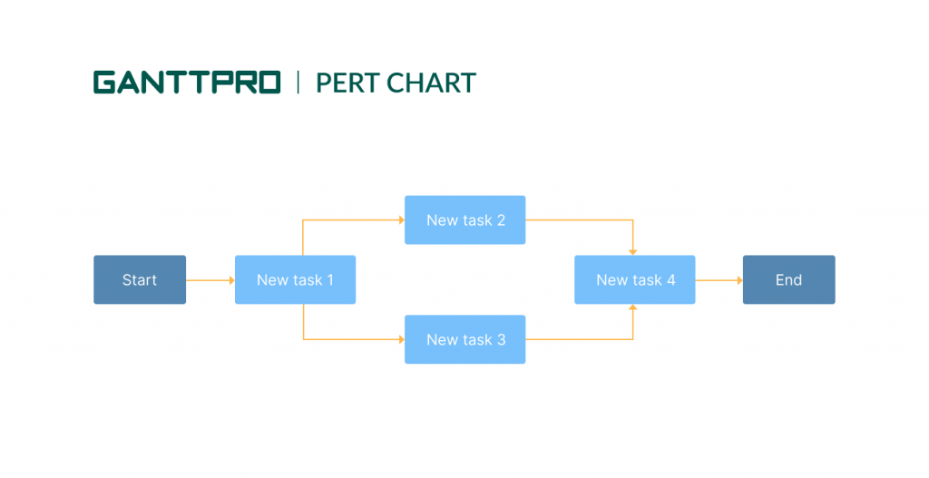
PERT stands for Program Evaluation and Review Technique. A PERT chart is typically visualized as a series of circles. They are interconnected by arrows.
The center of each circle contains the name of a certain project activity. The arrows illustrate how the team will complete the activities, from one milestone to the next.
Project managers use this network of interconnected tasks to compile a more efficient schedule and closely follow its progress.
The chart is especially helpful when you aren’t sure about the project timeline. This system of circles and arrows allows detailing a number of tasks that take place simultaneously and illustrates how the progress of one will impact the other.
In the world of project management, this diagram is no less popular than the invention of Henry Gantt. Both systems are not inherently competitive, however, the issue of “PERT chart vs. Gantt chart” often provokes heated debates and discussion.
PERT is a free-form diagram, while a Gantt chart contains bar graphs. The first tool helps think out how long your project will take and identify dependencies between plan tasks. The second one is used for spotting project bottlenecks to make operational corrections and not deviate from the set plan.
Therefore, the PERT chart is more profitable during the project planning stage, while the Gantt diagram assists when a project is actually going.
PERT chart benefits:
- Provides a graphical display of project activities that helps to better understand the relationships among them.
- Permits tactical-level planning and operational-level control of projects.
- Allows planning large and complex projects.
- Provides the visibility of a critical path.
- Allows for individual activity analyses.
- Helps to coordinate various departments.
- Allows to do “What if” analysis.
Provided by tools: SmartDraw, ConceptDraw, EdrawMax.
3. Pareto chart
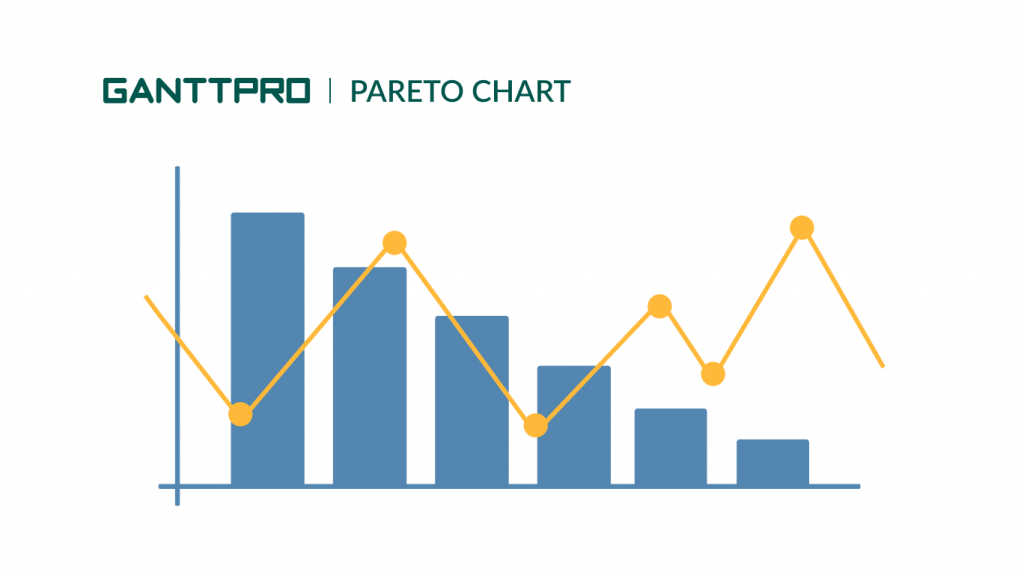
The next tool in our list of popular project management charts is a Pareto chart. This histogram shows the quantitative ratios of different indicators in descending order of frequency.
It has Italian roots. The author, Vilfredo Pareto, was involved in engineering, economics, sociology, and other disciplines and sciences.
The tool allows you to distribute efforts to resolve emerging problems and identify the reasons for which you need to start optimization. If an online Gantt chart helps to visualize planning and project issues, a Pareto chart, based on the rule of the same name, helps to assess losses and effectively analyze activities.
This system is mostly used in a Six Sigma analysis and often in project management scenarios. Managers use it when they want to get more info about their projects.
The Pareto chart is represented by columns, the order of which is descending from left to right. These columns can represent the types of defects, their localization, errors, etc. It means that the most important causes that you should pay attention to are on the left. The height of the columns demonstrates the frequency of defects occurrence, their ratio as a percentage, cost, time, etc.
Pareto chart benefits:
- Helps to determine the root causes of defects or problems.
- Provides a better explanation of defects that should be resolved first.
- Helps to define cumulative impact of defects.
- Enhances problem-solving skills.
- Improves decision making.
Provided by tools: Visual Paradigm, Tallyfy, Excel.
4. Work Breakdown Structure
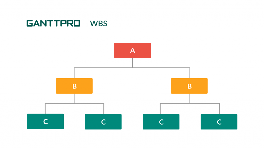
A Work Breakdown Structure (WBS) is also in the list of the сharts used for project management. This chart is a deliverable-oriented project breakdown into smaller manageable units.
Breaking tasks into such sections is a well-known productivity technique, so the WBS structure is the tool to implement it.
WBS does not provide stats or figures to display. However, this system is a good helper in simplifying the way to manage affairs. By applying it, you will be able to execute your project in a systematic way and ensure the right resource allocation.
Breaking down the project and generating a task hierarchy will empower you to prepare a better project plan, schedule work, and ensure systematic work execution.
Find more about Work Breakdown structure examples.
WBS benefits:
- Defines and organizes the required work.
- Provides a visual of the entire scope.
- Facilitates the quick schedule development by allocating effort estimates to specific sections.
- Provides a proven approach to planning projects.
- Improves collaboration and arranging team brainstorming sessions.
- Ensures that vital deliverables are not forgotten.
- Provides a way to estimate project costs.
- Boosts transparency and accountability.
- Helps to identify risks in a better way.
Provided by tools: Creately, Caflou, Planhammer.
5. Bar chart
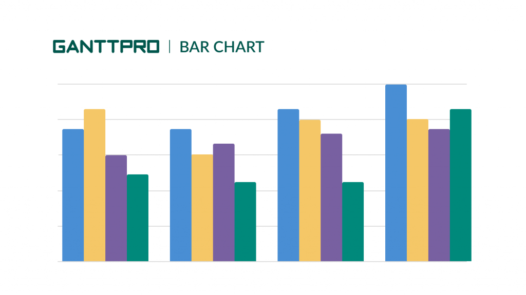
A bar chart is a handy and easy to interpret system containing rectangular bars.
The lengths and heights of these bars are proportional to the frequencies and values that they represent. You can easily use a bar chart to visualize a variety of project data, from working hours to the number of completed tasks.
A typical bar diagram consists of two axes. One of them depicts the different categories to be compared while the other one represents the parameter of comparison.
Here’s the list of the common characteristics of this chart:
- You can draw rectangular bars horizontally or vertically.
- All bars have a common base.
- Each bar or column has an equal width.
- The height of the bar corresponds to the value of the data.
- The distance between each bar is the same.
The vertical option is the most commonly used bar diagram. Apart from the vertical and horizontal views, there are also a grouped bar graph and a stacked bar graph.
Bar chart benefits:
- Shows each data category in a frequency distribution.
- Provides easy to read scales and figures.
- Summarizes a large amount of data in an easily interpretable way.
- Clarifies trends better than tables do.
- Helps to compare data sets.
- Estimates key values at a glance.
- Allows visual checking of the accuracy of calculations.
- Can be used by various spheres and industries.
- Permits clear and simple calculations.
Provided by tools: Canva, Visme, Rapidtables.
6. Flowchart
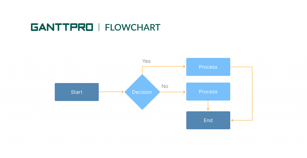
The next option looks appropriate for small projects with several processes and flows of activities.
Perhaps, a flowchart doesn’t lead in terms of demand among modern project management charts and diagrams; however, its importance is often underestimated.
A flowchart simplifies managing projects and makes PM’s lives easier when they are working on complicated processes.
This graphical representation of the workflow contains all crucial activities and processes that happen between the start and the end of your project. You work with boxes, figures of different shapes, and arrows that illustrate the sequence of events and the way they are connected.
This chart system paves the way for seamless communication needed to ensure flawless project planning and monitoring. For large-scale projects, a flowchart is often used in combination with a Gantt diagram.
Flowchart benefits:
- Provides an overview of the system and shows the relationship between various steps.
- Promotes logical accuracy.
- Facilitates troubleshooting.
- Helps to understand where processes have logical complexities.
- Indicates the role played at each level.
- Prevents future inconveniences.
- Ensures that all logical paths will be completed.
Provided by tools: Miro, Gliffy, Edraw Max.
7. SWOT analysis
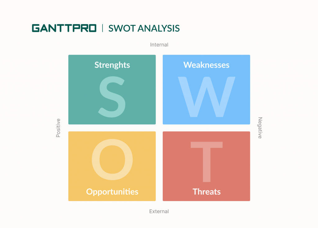
SWOT stands for Strengths, Weaknesses, Opportunities, and Threats.
Project managers all over the world consider a SWOT analysis one of the best project management charts for stakeholders because it clearly demonstrates the strength and potential risks of the project when it’s in the planning stage.
It will work for you in case your team wants to exchange real-time data rather than prescribing messages.
This chart helps managers to make the necessary decisions to boost the success rate. It also demonstrates a clear picture of what your competitors are doing precisely to ensure project success.
Let’s say, a SWOT analysis represents a project management diagram that further assists in attaining high-efficiency levels.
SWOT analysis benefits:
- Helps to understand your project better.
- Helps to take advantage of your strengths, identify weaknesses, deter threats, and capitalize on opportunities.
- Assists in developing goals and objectives.
- Can be applied to any company and business.
- Allows comprehensive data integration.
Provided by tools: Swotanalysis, Designcap, Venngage.
8. Pie chart
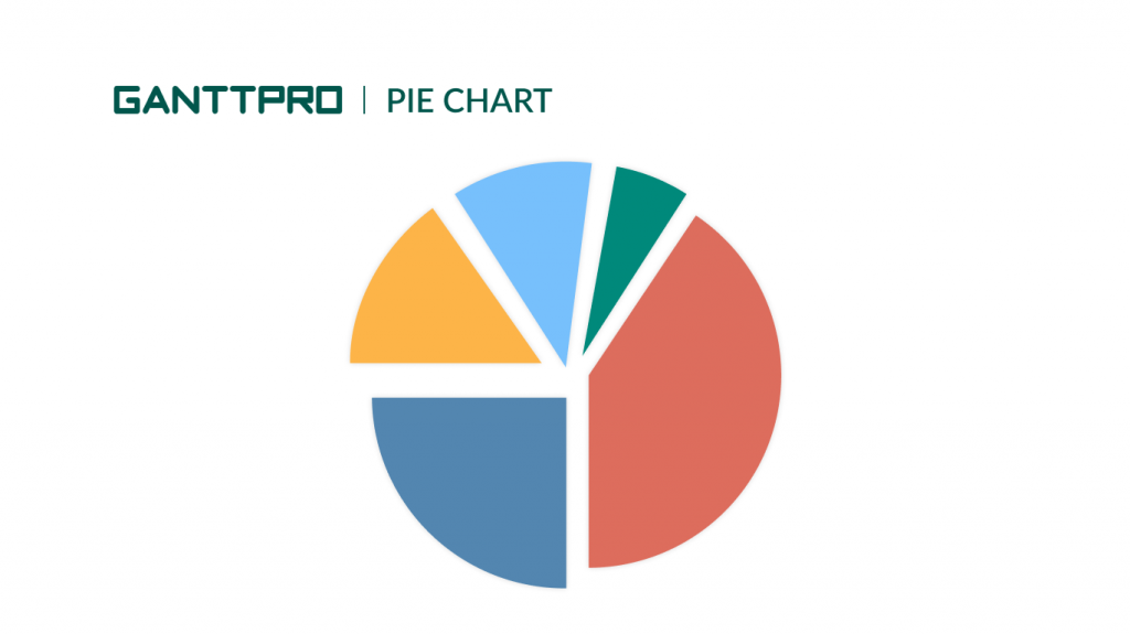
A Pie chart also keeps its popularity in project management.
This flexible chart can be used for representing different types of project data. It has a circular shape and acts as a handy tool for data segmentation.
The chart divides various data categories related to the essential project processes into slices that have their own specific identity. The arc length of every slice corresponds to the quantity of information that it represents.
Project managers value this graph as it illustrates the numeric proportions of various categories that form a collective whole. It suits projects for all levels of complexities.
Pie chart benefits:
- Provides a simple and easy-to-understand picture.
- Shows data as a fractional part of a whole.
- Summarizes a large data set in visual form.
- Helps to understand information quickly and make an immediate analysis.
- Allows manipulating pieces of data to emphasize points you want to make.
- Helps to measure underlying numbers.
- Creates a visual model that can be used when comparing different data sets.
Provided by tools: Pictochart, Meta-chart, Infogram.
9. Control chart
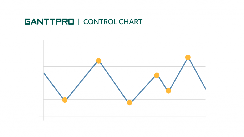
This kind of PM chart is a good choice in case you want to track a certain project process.
A Control chart is widely used for observing changes in the process behavior. It helps to define the stability of any process and identify problems at the early stages.
By applying this system, project managers can be sure that the project executes as smoothly as possible while experiencing minimum hindrances.
The chart has upper and lower control limits and an average process output. If the graph line remains in between the upper and the lower control limits, the process behavior is fine. If it touches or crosses the market control limits, the process behavior looks undesirable.
Control chart benefits:
- Helps to understand the variations present in processes.
- Helps to recognize problem indicators to take corrective action.
- Allows observing patterns within plotted points. These patterns indicate causes, which can help to find possible solutions.
- Assists in forecasting future performance.
- Helps to find and make new ideas for improving quality based on an analysis.
Provided by tools: PQsystems, QIMacros, Lucidchart.
10. Cause and effect chart
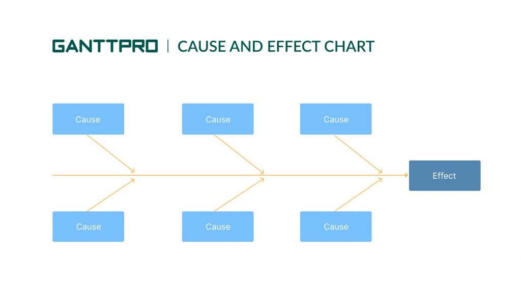
This chart is a handy visualization tool that helps to logically organize the possible causes of a specific problem in the project. When you are able to identify the potential causes, you can more easily recognize the root cause. You may also know it as a Fishbone diagram.
Managers usually apply the Cause and effect chart in the early stages of projects to uplift their success rate and minimize the issues in a lesser amount of time. It also helps to conduct brainstorming sessions that can lead to innovative ideas.
Cause and effect chart benefits:
- Displays relationships in a clear and logical way.
- Provides a comprehensive root cause analysis.
- Allows seeing how causes work together.
- Gives an objective look at how safety issues originate and develop.
- Helps to maintain team focus.
- Stimulates problem solving.
- Helps to understand contributing factors.
- Assists in developing comprehensive risk controls.
- Facilitates brainstorming.
Provided by tools: XMind, Coggle, MindMeister.
How to choose a chart type depending on a project size
Now you know that PM charts can be applied for a wide range of use cases. What you have to do in order to better use the capabilities of each graph is to determine the most appropriate way they can be applied.
Best charts for small projects
Many types of project management charts provide a more simplistic way of displaying data, therefore they can only cope with a smaller volume of data.
If you include complex information from a large project, these diagrams will become impossible to interpret.
For example, a Bar chart or a Pie diagram will be good for a small project as they can only show the relation between two values. A Flowchart is also a great aid to small project management because it is simple and quick to produce.
Best charts for complex projects
There are charts that perform better when applied to enterprise-level project management.
A Pareto diagram displays far more data than a standard Bar chart. It looks suitable for large project management.
A Gantt chart is also one of the best ways to visualize the entire team’s workflow. It helps managers to easily oversee their team progress and monitor the contribution of every individual. It may surprise you how many teams of different sizes and industries use a Gantt chart.
There is no bad chart, but only the problem of choice
That was our list of the best charts for project management that you can use right away. They will be your reliable helpers for managing different phases of project development in a systematic way.
As you can guess, there are a lot more professional ways to visualize tasks and processes which can be more suitable to your requirements than the mentioned solutions.
Don’t hesitate to try them to make your life easier. Combine various charts, streamline your projects, apply creative ways for project visualization, and lead your rivals. There is no bad project management chart. It’s up to you what to choose.