How to Make a Gantt Chart in Excel
March 12, 2021 / Estimated reading time: 8 minutes
You hardly meet someone who never heard about Microsoft Office and Microsoft Excel in particular. This office suite includes a variety of useful apps for convenient day-to-day work. Thousands of people use it every day with different aims be it something for your office needs or at home.
Excel is very popular software presented in a spreadsheet form. The full list of its features is really long so one can do many operations in it: calculate, create pivot tables, charts, sparklines, etc. Probably, you will be surprised, but users do not even realize the full-featured power of Microsoft Excel.
For example, you can use it in project management with the help of Gantt charts that you can create right inside of it. Have you ever heard about it? If no, you will find this article useful as here we present a step-by-step tutorial on how to make a Gantt chart in Excel. You can also use an Excel template like Gantt chart Excel to create a Gantt chart.
How to make a Gantt chart in Excel:
- Create your task table
- Create your Gantt chart using a stacked bar
- Add start dates and duration of your tasks
- Insert your tasks
- Format your chart
What is a Gantt chart in Excel?
A Gantt chart in Excel is like any other Gantt chart in other tools.
For example, you can create a Gantt chart in MS Project, the popular, yet hard-to-learn tool. Or you can even try unexpected for this case solutions and make a Gantt chart in PowerPoint or, surprisingly, in Word.
However, it is much better to use special software and create Gantt charts in GanttPRO, for example.
This chart that was devised by Henry Gantt to show a project schedule has common features with no difference what software you use.
A Gantt chart consists of lines expanded along a timeline. Those lines are tasks. So, anyone who decides to use a Gantt chart for project management has duties and timeframes visualized in front of them. Such a principle is implemented in standard Gantt chart software, Excel is no exception here.
How to make a Gantt chart in Excel
If you set your mind on creating your chart in Microsoft product, here is step-by-step instruction how to do it in Excel 2010. Actually, there is no big difference between Excel 2010, Excel 2013 or Excel 2016.
1. Create your task table
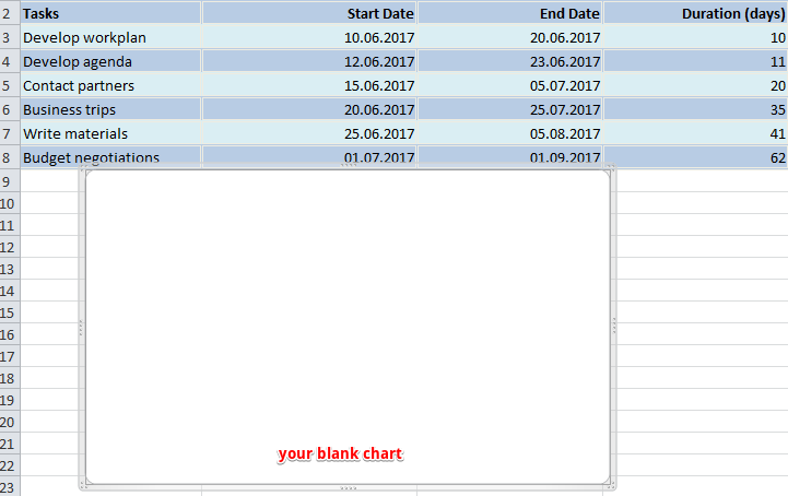
Here we put down all information that is necessary for a project – tasks, their start/end dates and duration of each responsibility expressed in days.
Here what I have for the project connected with event planning.
2. Create your Gantt chart using a stacked bar
Then you need to do the following:
a. Click on any blank cell
b. Go up and choose Insert tab
c. Click on bar chart icon. In the menu that drops down choose a stacked bar.
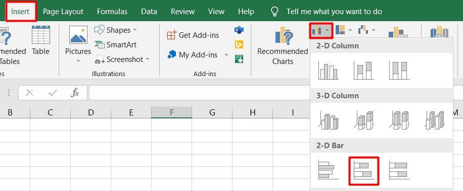
d. Thus you inserted a blank window where you will create your Gantt chart.
3. Add start dates and duration of your tasks
Then we need to do a few clicks in order to transfer the data from the table into our Gantt chart.
a. Right-click on any empty space in your blank chart. From the menu choose Select Data. You will see a new window.
b. Go in there a little bit down and to the left where you will find Legend Entries (Series) line. Under it there is an Add button. Click on it to open a new window.
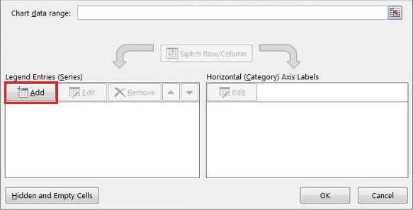
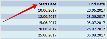
c. There are two fields, and all of them we need to fill in. Click on Series Name and after it on the column header with the phrase Start date in your table. Thus we will move this phrase into the chart.
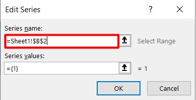
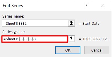
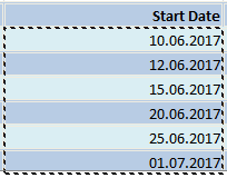
Let’s proceed to the second field where dates should be entered. Click on the icon to the right of it. A new small window will appear. Choose the cell with your first date (in my case it is 10.06.2017) and drag your mouse down to the last one. Thus you will highlight all dates. Make sure you include them only.
Then click again on that small icon on the right of the field. Your dates will be entered into the field in that window. Click OK. Now all your start dates are included in your chart.
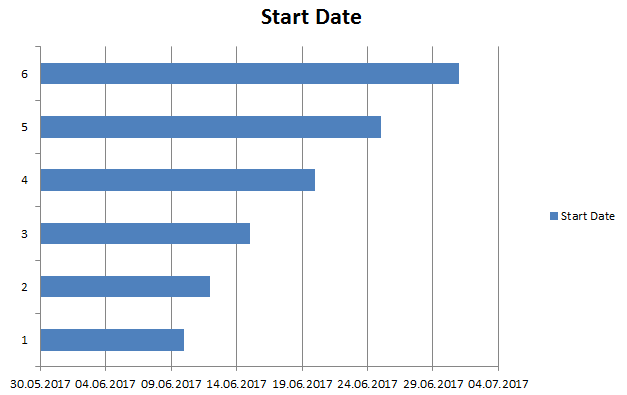
Here is what you are supposed to see after all those steps.
The same procedure is used to add the duration of each assignment in your Gantt chart.
To put it shortly:
a. Click on Add button under Legend Entries (Series) line.
b. Fill in two fields exactly in the same way as we did it above.
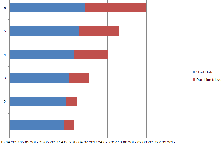
Your Gantt chart in Excel should look something like this.
4. Insert your tasks
a. Here we again deal with the menu Select Data. For this push the right button of the mouse on any of the blue bars. Then we will see the already familiar window. But this time we need the right part of it – Horizontal (Category) Axis Labels Under it click on Edit.
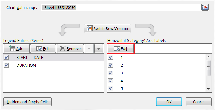
b. A new small window will appear. Do not close it. Click on the first task name (in my case it is develop workplan) and drag your mouse down to the last task. Click OK. Now your Gantt chart maker in Excel includes all assignments names instead of numbers.
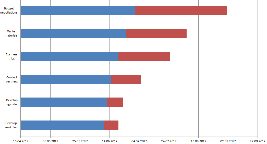
Here it is! Our Gantt chart in Excel is almost ready. We need to do a few more actions in order to give it greater look.
5. Format your chart
Personally, I do not find such a look convenient and easy to understand. So let’s make a few more steps and format it.
a. If you don’t like the legend on the right and want to have more space, simply delete it. This is very simple – right click on it and choose Delete.
b. You are attentive, aren’t you? The chart has a reverse order – the first task is at the bottom while the last one is at the top. Let’s fix it.
Click on any of your tasks on the left. This action allows you to select all of them. Then push the right button of your mouse and choose Format Axis. Check the box in Categories in reverse order line and close it. Now your Gantt chart has the right order.
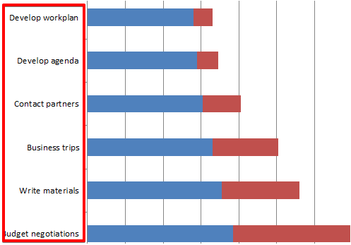
c. Let’s hide blue lines as we don’t need them in our Gantt chart. Select any of those lines what automatically select all of them. Right-click and choose Format data series. Choose Fill – No Fill; Border Color – No Line.
Here what we’ve got.
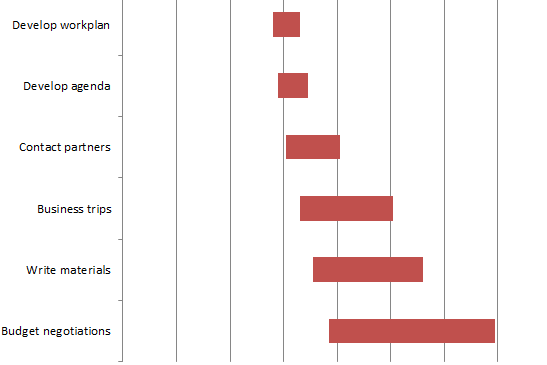
d. We don’t need this white empty space either and will move our tasks durations close to the tasks themselves.
Let’s go back to our tasks table and right-click on the first task date. Choose Format Cells – General. Here we see the number. In my case, it is 42896. Remember it or better put it down – we will need it in our next steps. Then press Cancel.
Choose dates that are above the bars in our Gantt plan. Right click on it and choose Format Axis.
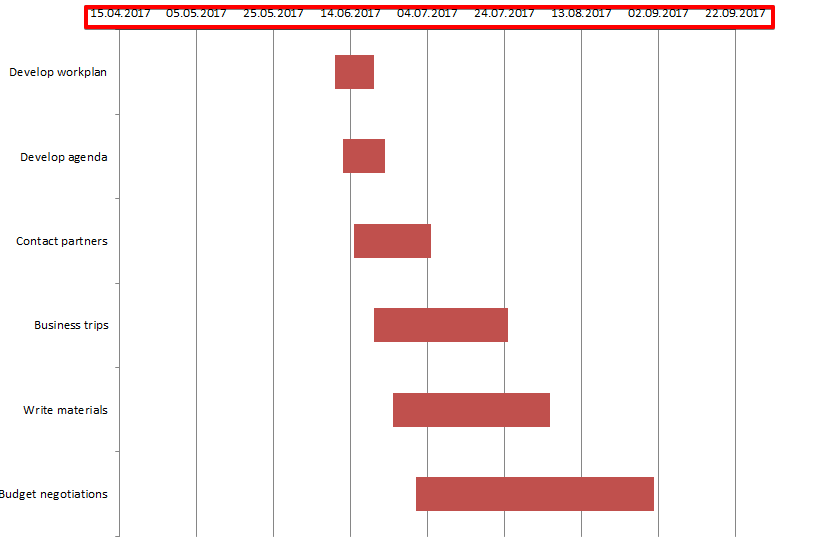
In Axis Options change Minimum bound from Auto into Fixed and enter the number we recorded in the above point. Here what we’ve got now.
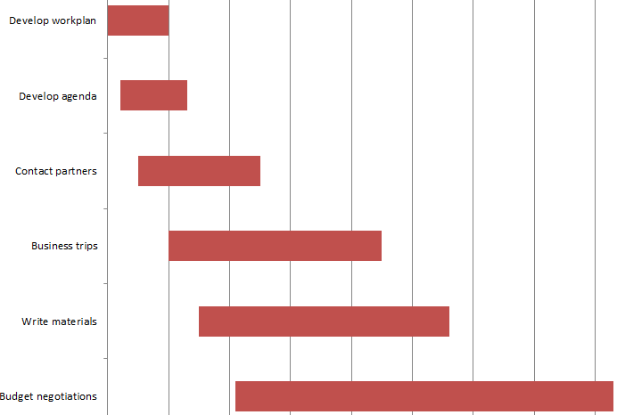
e. We may also change the distance between our tasks. For this, we need to right-click on any of our tasks, choose Format Data Series and change Gap width to something close to 0%. I made it 10%.
Here is the final Gantt chart that I have at the end of my work.
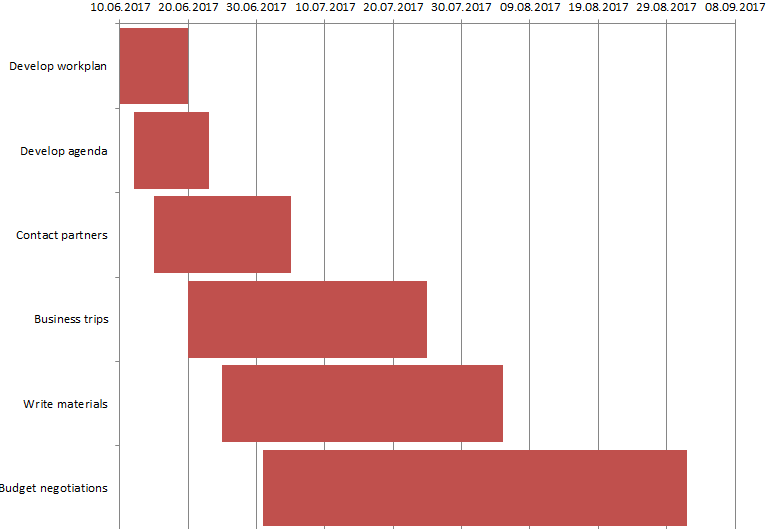
How to use a Gantt chart in Excel
You can use your Excel Gantt chart for project management or for personal needs like preparation for an exam, house building, etc. It is multipurpose, and everything depends on your actual requirements.
The thing is that this Gantt chart in Excel is not so convenient to work with and not serviceable. You have assignments and dates in front of you, but this is almost all. To add a new responsibility or to change duration, one needs to make all those steps again.
If you do not like reading and find these instructions rather hard to follow, here is the video with the same steps. Watch it and create your first Gantt chart.
What is a better way out?
Try GanttPRO Gantt chart software. It has not complicated Excel-like instructions how to work with it. Instead, it offers a wide range of useful features like dependencies between tasks, their assignment to team members, resource management, critical path, milestones, and many others.
Moreover, you can import or export your Gantt chart in or from Excel. Learn how to do it from this video.
Try the tool on your own and become an experienced user in a few minutes.
Also, there is one more convenient option to create charts in the software that you are familiar with – Google Sheets. For example, you can use a template to create a Gantt chart in Google Sheets.
What is your opinion of the Gantt chart in Excel? Do you find this chart useful for you? Share your experience with us 🙂

